Reach For Rescue Rebrand
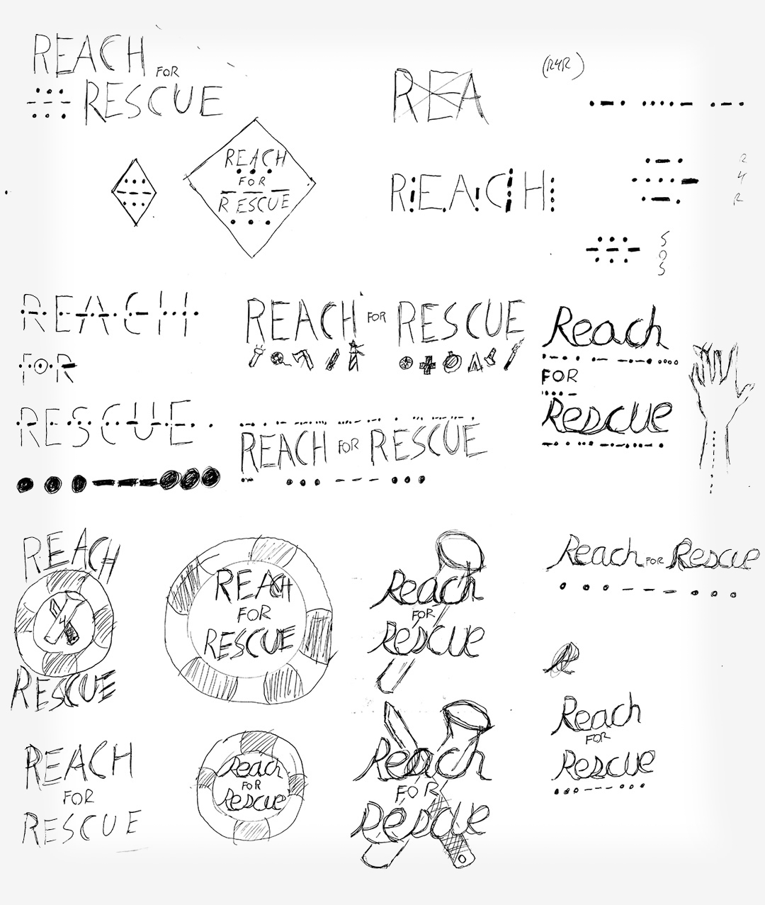
Reach for Rescue was a local Portland band who were starting to make waves in the local music scene. They played within the genre of Post-Hardcore/Metalcore with many other Metal and Hardcore influences throughout their music. Their music focuses on positive mental health and wellbeing. While the band was rising in popularity, they needed a new logo design which spoke to their current fans and helped to draw in new fans around Portland and the rest of the country. The new design needed to also be accompanied by new merchandise, equipment, and web marketing materials. The band wanted to differentiate themselves by fostering a look and feel that is a bit cleaner and professional than the current styles in their music scene. The first image to the right shows some of my creative process while trying to merge the band's message with their style.

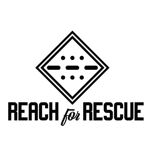
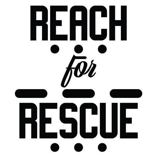
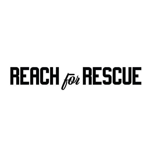

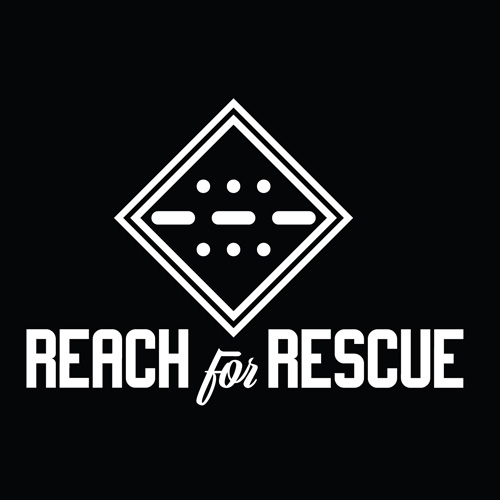
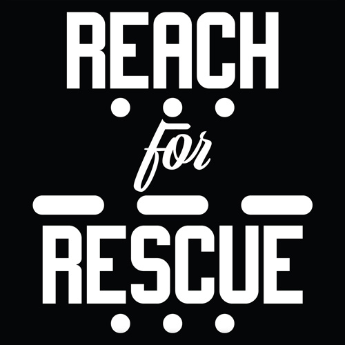
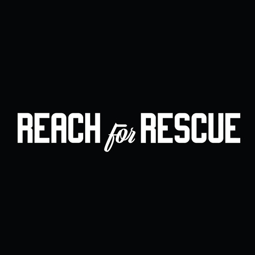
I eventually settled on a very clean design that I felt represented their values. It stands out and creates an easy visual for fans to instantly recognize them and their media. From the initial logo and logotype, I created a few different versions and inverted color schemes to be used on a wide variety of merchandise and media.
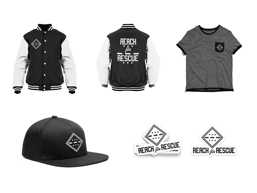
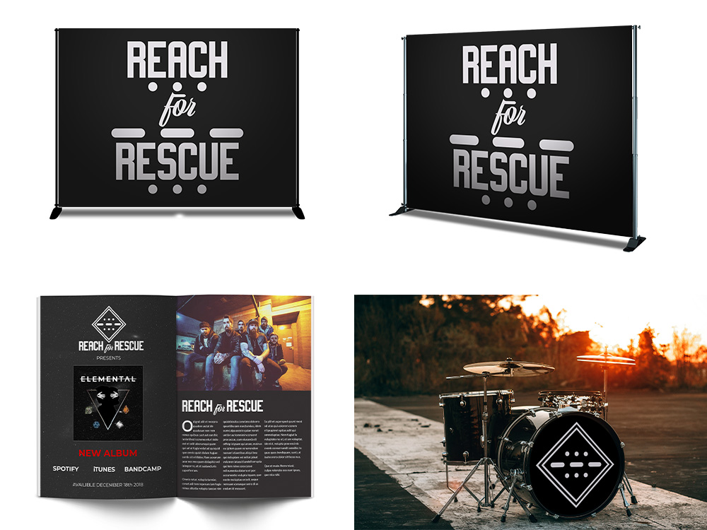
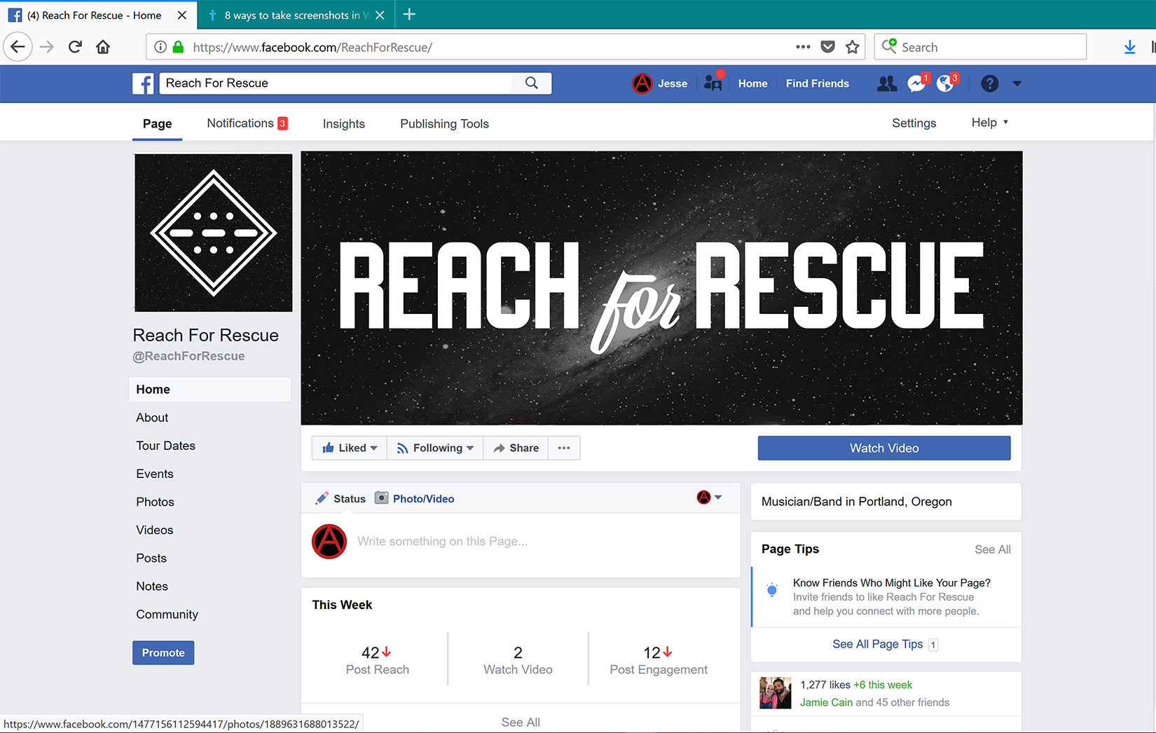
Each version of the logo was well suited to different uses, which I represented with these mock ups of various types of merchandise, equipment and media.
Using some elements from their recent album, I was able to incorporate the logo and their current style to create a unified and recognizable design scheme. This would ensure fans knew instantly what band they were interacting with.
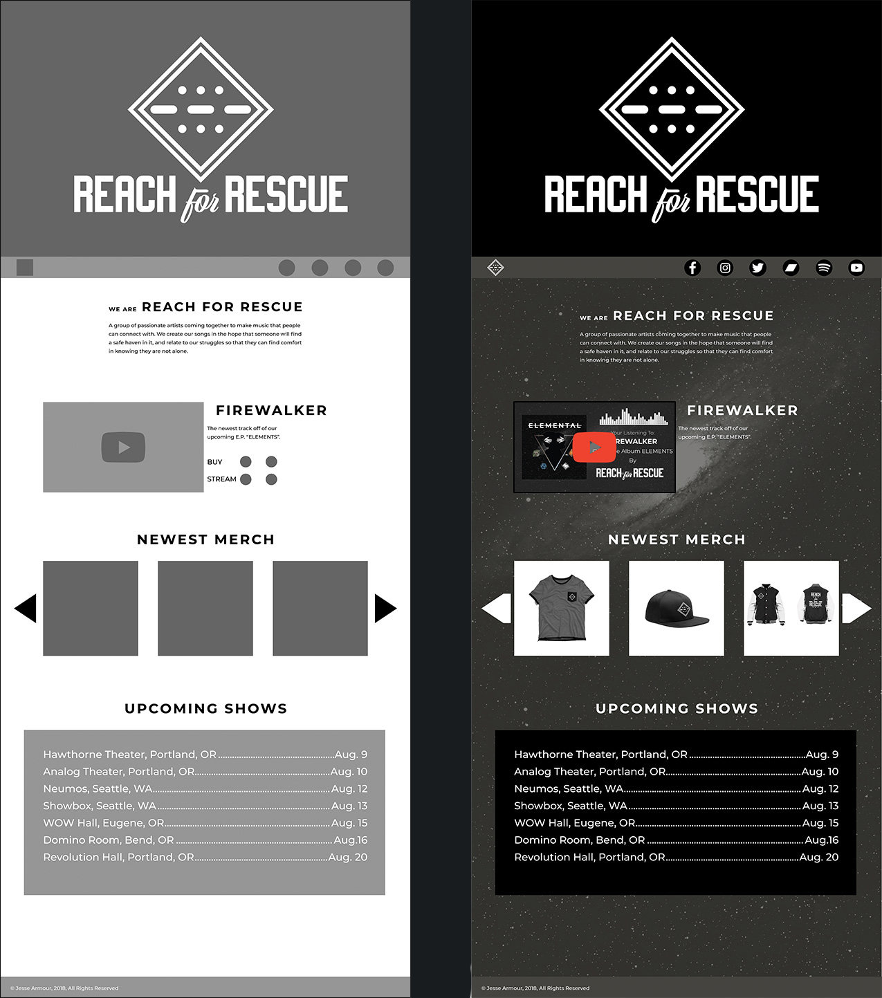
For the final deliverable, I used all of the inspiration and new style from the logo and social media designs to create a simple one page website for the band to promote their music on. I made sure to incorporate familiar imagery so the rebrand wasn't too drastic, but made sure the end product had a much cleaner and clearer look and feel.